01
Start with where it will be read
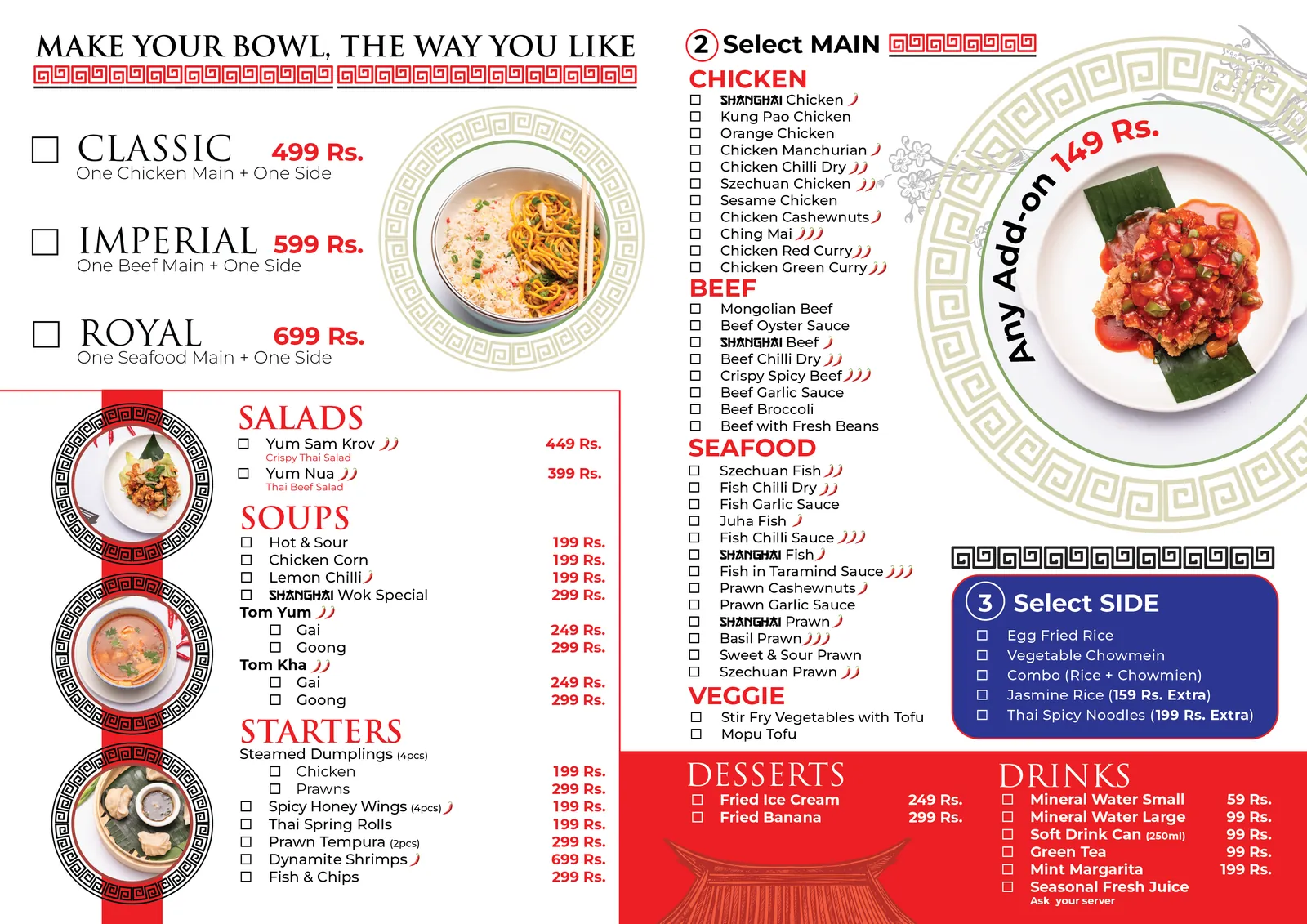
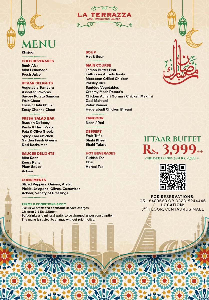
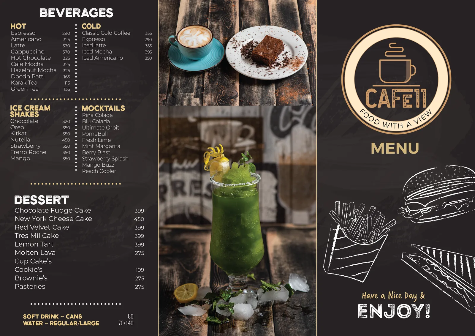
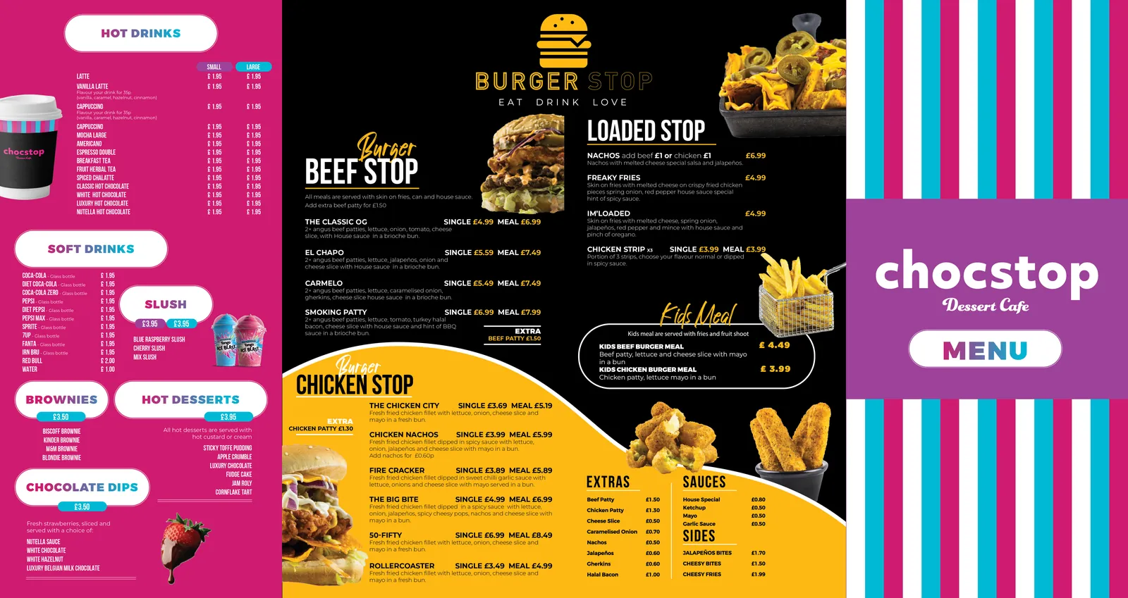
A menu is read in one of four places, and each one wants a different design: in the hand at a table, on a wall above a counter, on a phone from a QR code, or in a window from the street. Decide which before you open the software. A book menu that works beautifully at a table is unreadable above a counter; a wall board with twenty dishes in 24-point type is a wall of noise.
- At the table: the reader has time and light. Descriptions can be full, the type can be smaller, and the menu can run to pages.
- Above the counter: the reader is standing, queuing, three metres away. Dish, price, nothing else; type you can read at that distance; no more than a dozen items a board.
- On a phone: one column, big type, prices aligned, sections that collapse. A PDF of the printed menu is not a phone menu.
- In a window: a headline, four or five dishes, a price that stops someone walking past.
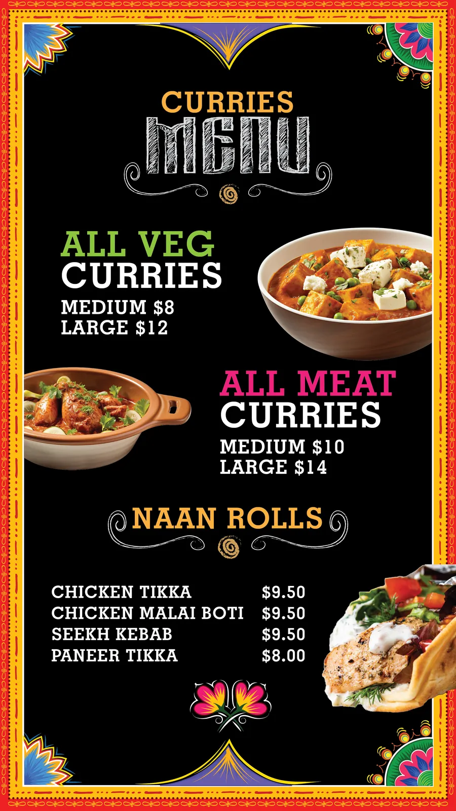
Where it lives also decides what it is printed on. The print desk's guide to restaurant menu printing covers stock, laminates and synthetic paper by location; this page covers what goes on it.